In its effort to support the American Kenpo community, EPAKS has fully supported the development of a modern version of the American Kenpo Crest. This effort came about in the desire to see the American Kenpo community flourish into the 21st century, yet still acknowledge its foundations - free from copyright and other legal issues that arose after SGM Parker's death about the use of some of the imagery developed by him.
This new crest is designed to be open to all: to copy, use, wear, and/or display without fear from any legal entanglements. It was developed specifically to be open source and free for everyone to use. It was developed by the American Kenpo community, for the American Kenpo community.
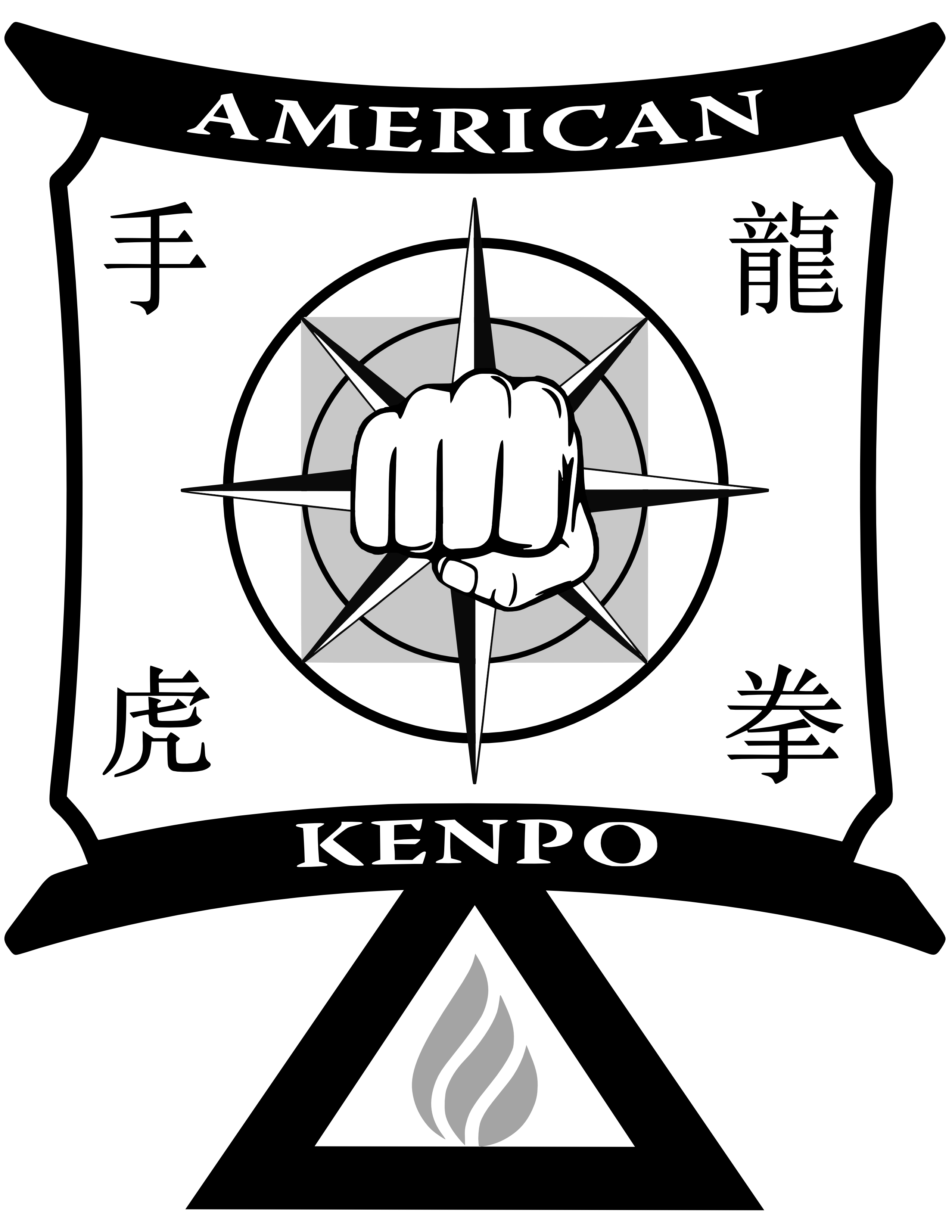
Write-up about the crest:
Purpose:
The purpose of this design is to create a modern image which honors the history of American Kenpo; summarizes the foundational principles, ideas, and concepts at its core; is as distinguishable and unique as the art itself; and can be used and displayed with pride by any and all of its many practitioners – regardless of affiliation, lineage, and / or political alignment.
Theme:
The overall theme of the new image is to show respect and highlight American Kenpo's history - from its original Chinese / Indian origins up to present day, and to do so in a manner that is concise, symbolic, thorough, and unique.
Name:
American Kenpo crest – a.k.a. The Kenpo Solidarity crest / The Kenpo Unity crest
Meanings:
This is a summary composition of the major elements of the design. There are many more historical and subtle meanings which are purposely omitted from this write-up and left up to the observer to discover by themselves; but which may be further delved into in separate documents / discussions.
Shape:

A distinct, but historically familiar shape which represents the unity of the Kenpo community, the inclusion of all who practice the art, and an honoring of both its Asian and American roots.
•The top section is composed of primarily circular elements, which represent the more advanced (or higher) motions of the art
•The bottom section is composed of primarily linear elements, which represent the more basic (or lower) motions of the art
•The top section is supported by the bottom section, which represents the concept - "where straight lines end, circles begin, and visa-versa"
•The rounded points and sloping arches of the top section represents the concept that the ultimate aim of a Kenpoist is to round off corners and elongate circles
•The upward and outward arches of the top section express the general shape of the pagoda; which represents the warding off of negative, evil, and / or malicious intentions, thoughts, and actions
•The bottom section also contains the most advanced element of the design, the flame, which represent alpha and omega - i.e. both the beginning and the end of one's Kenpo journey
Colors:
•White (background) - Represents the foundation of the art, the non-initiated and / or white belts and those we are duty bound to protect
•Black (frame) – Represents the goal of physical perfection of the art
•Red (flame) – Represents the goal of wisdom and mastery of the art, from a spiritual and mental aspect
•Gray (square) – Represents the reminder that the physical aspects of our art are always controlled by the mental aspects
Interior Shapes:
•Triangle / Circle / Square – Highlights the 3 primary shapes of Kenpo
•Lines / Circles – Highlights the understanding that all motion is a line or a circle
Writing:
•American Kenpo – Honoring the art we practice
•Chinese – Honoring the origins of the art (translations follow): upper left = hand / upper right = dragon / lower left = tiger / lower right = fist

Symbolic elements:
•Flame

oRepresents the flame that burns in every practitioner to achieve wisdom, mental, and physical perfection of the art - a goal for which one must always strive, but can never fully achieve
oHighlights the 3 levels of advanced achievement – instructor, professor, master
oRests inside the white plain of the triangle, not the black, to remind the advanced practitioner from where they began
oTouches the bottom of the triangle (the base) but never quite reaches the top (total mastery).
oIs not solid and monolithic, and incorporates the white color all the way through it, to highlight that even the master practitioners still contain elements of and rely upon the novices
•Triangle

oRepresents the 3 levels of physical / mental acumen and experience of practitioners of the art
oThe strongest of foundational shapes which supports the entire structure of the art (the top part of the design)
oHighlights rule #1 of self-defense: establish a base
oHighlights the concept of brace angle
•Fist

oRepresents the physical aspect of the art
oPlaced in a gray field as a reminder that all of our physical interactions are governed and controlled by our minds
•Circle / Square / Circle

oHighlights the concept: "the square in the circle and the circle in the square" and "zones of sanctuary"
oThe gray of the square never fills the enclosing circle, highlighting the fact that one never achieves full mastery of the mind
oThe 2 circles highlight the 2 primary physical ranges 'close' and 'far'
•Compass Rose / Dharma Wheel

oExposes the concepts of: opposite (white / black) and reverse (directions)
oExposes the advanced movement of the figure 8 (shape of the points - combined)
oHighlights the 8 primary angles of the original hand movements
oHighlights the 3 primary symbols in Kenpo – the '-' (line), '+' (plus), and 'x' (diagonal plus)
oRepresents the internal compass that all practitioners should have to use their skills for good and righteousness
oHighlights the concept of Dharma – which embodies conduct, virtues, duty, law, and cosmic law and order
oRecognizes that the original practitioner that brought the martial arts to China originated in India
FAQ:
Who created the crest?
The design was put together by a cadre of community minded Kenpo practitioners, with a combined total of hundreds of years' experience in Kenpo. The group agreed that the final product was to be released under the EPAKS brand. EPAKS was chosen because of its outstanding reputation for releasing quality products to the community and its community minded goals. The participants agreed to volunteer their time and expertise only if no single individual would get credit and that when the project was completed the final design would be made available to the Kenpo community for use without hassles and/or royalties, forever.
How did the design come about?
The design started from scratch with a list of important elements that needed to be included due to their historical and / or conceptual relevance to and the development / understanding of Kenpo. Then each element was carefully composed into the final design with each location / placement and inclusion debated and defended. This process took many weeks of back and forth discussions until the entire design group agreed that the final design was complete. Many individuals outside the group were also contacted about the project and exposed to the design while it was still under development, to get ideas, feedback, and opinion; and to help with the acceptance of the overall goal of the project.
Why wasn't the existing Association Crest just copied and modified like most everyone else's crest / design?
The design was specifically created so as to NOT be a copy of the Association Crest. But, rather a completely unique and modern design with each and every element of the design portraying some element of either Kenpo principles, theory, concepts, or ideas and / or Kenpo history. The entire group respects the original Association Crest and felt that it was and is a distinctive symbol of Kenpo's American origins and should be left as such.
Why create a new design?
For various reasons, an ever growing number of practitioners, groups, associations, and organizations are deciding to move away from the use of the Association Crest. Concern for long-term unity of the Kenpo community was the nexus for this project. We all respect the art, have a shared goal of perpetuating it, and want to see it stay as a united and admired martial art, worldwide. The intention and hope of this design is to create a common way in which we all can proudly show our unity and commonality, in addition to or in place of the current Association Crest and / or other, more specific, crest(s). In summary, this new design is the result of a desire to allow all Kenpo practitioners, regardless of affiliation or association, to proudly display a unifying symbol of their distinctive martial art in a non-political and non-commercial way.
Can I get a copy of the design and use it on my own products, materials, equipment, etc...?
Yes! The graphic is made available, in many different formats, to anyone who requests it. It was specifically created for use by and for the Kenpo community, without charge.
Can I modify the design for my own purposes?
Yes. But we are hoping that the community finds that the design is strong enough to stand on its own, without modification. The design is rich in symbolism and meaning, in both the elements and their placement, as well as the design overall. All we ask is that you first take the time to understand the importance of each element of the design, as well as its placement and relative position to other elements of the design, before modifying it. But, in the end, it is up to the individual / group to decide if they want to make a change to it. But, please remember that the intention of the design is for the entire Kenpo community, not a specific group or entity. So, we kindly ask that any modifications not be used as justification to make a claim to the entire design, but instead be executed with the same open intentions of this rendition of the design.
Are there patches of the crest available?
Yes. EPAKS, Inc. is making patches of the crest available to all practitioners. These patches are available for FREE, with only a shipping and handling charge. If you wish to get a few copies of the patch (they are available in both large and small sizes), all you need to do is reach out to us via our website - www.EPAKS.com. But, keep in mind that the crest is free to use and copy. So, anyone is able to get the crest image and produce patches, stickers, jewelry, etc. on their own.